
Bloomberg Product Admin Tool
Information architecture, systems design, 0-to-1
Lack of self-service
Admins of Bloomberg products are a distinct user group with minimal self-service options.
While a tool technically existed—mostly used internally by our employees—it was rarely shared with product admins due to its outdated, difficult-to-navigate interface and inconsistent visual design. Sales teams often discouraged its use.
Meanwhile, customer service reps spent significant time assisting admins with basic tasks like adding users, updating company info, or locating features.
The goal of this project was to design a new admin tool that supports a broad range of admin capabilities while reducing the workload on customer service.
Picking up where others left off
As the sole designer on this project, I worked closely with the Authentication and Fulfillment engineering team and my product manager to design and ship the first version of the admin portal.
I started by picking up where a previous design agency left off. A year earlier, they'd been contracted to solve this problem, but their work was incomplete when the contract ended. I reviewed their Figma files, documented key patterns, and aligned with my PM on which features to prioritize first.
I kept their core structure: summary pages (showing all entities at a glance) and detail pages (diving deep into a single entity). But I scrapped their metrics display at the top of pages; large numbers like “total users” felt arbitrary since admins typically logged in to complete specific tasks, not review statistics.
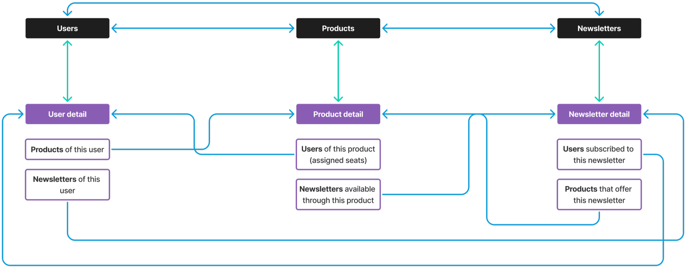
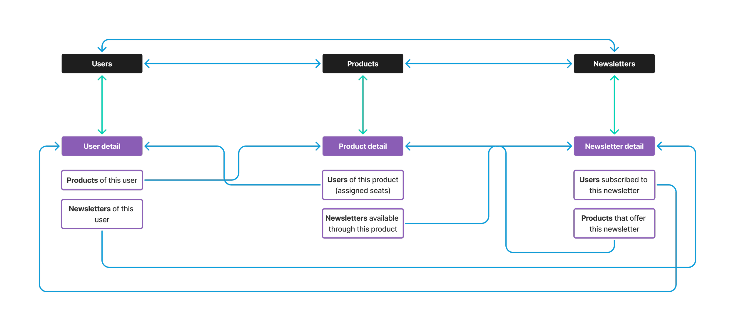
Interlinked page architecture
I identified three key entities: Users, Products, and Newsletters—each having a summary and detail page. Using this, I created the first iteration of the admin tool’s architecture.
Each entity would allow one-click navigation between its summary and detail pages. Within any summary or detail page, users could also navigate to the summary or detail pages of the other two entities. This design aimed to create a smooth, interconnected navigation experience.
MVP for each page type
I incrementally designed each of the six main pages and reviewed them with the Authentication and Fulfillment engineering team. Their feedback helped me decide which information to surface in tables versus detail pages, and what data was feasible to display given our backend constraints.
Meanwhile, on the Design Systems team...
After sharing this project with the team’s lead designer, she identified tables as one of the most frequently used elements in the admin tool designs. She suggested we collaborate in parallel to create an MVP table component. Over the next month, we worked together to audit tables across design teams and designed components for cells, rows, header rows, header columns, and the overall table structure.
Exploring simplification
After reviewing with internal stakeholders, we explored simplifying the architecture by removing the Newsletter summary page. Since different products offer different sets of newsletters, we considered managing subscriptions through the Products context rather than as a standalone entity.
Ultimately, we kept Newsletters as a section on User and Product detail pages while maintaining flexibility to add a summary page if needed later.
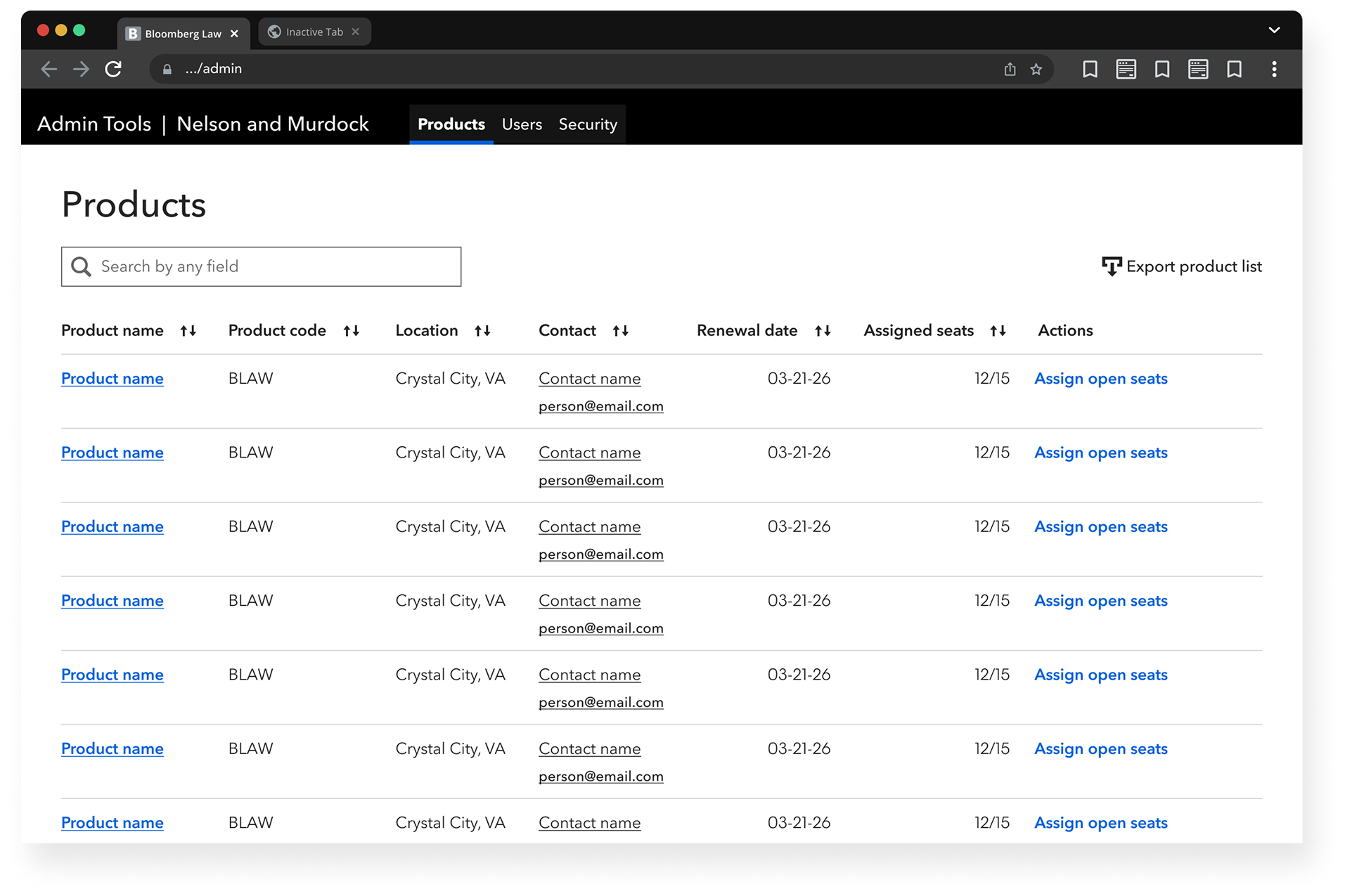
Product summary page
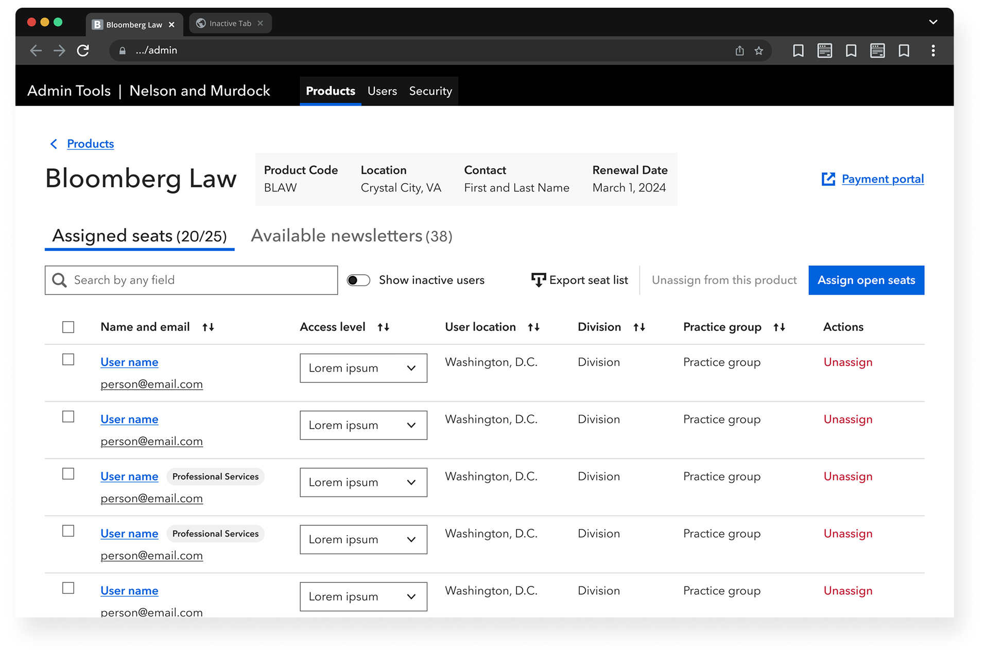
Product detail page
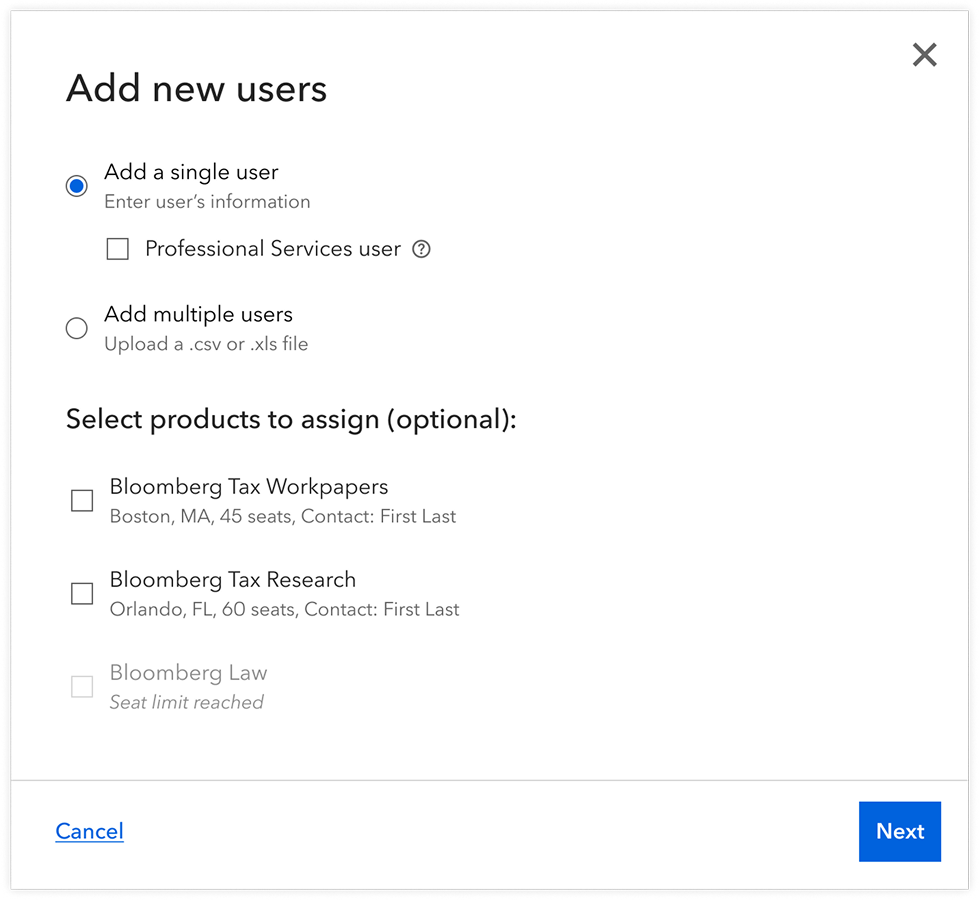
Adding users
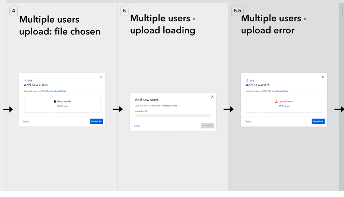
Many pages in the admin tool involved multi-step processes. One of the most important was adding users to the system, either manually (one at a time) or via batch upload using a .csv file.
From the small pool of external customers, we heard that it was too easy to accidentally add a user without assigning them to a product, leading to confusion and extra steps later.
To address this, I introduced product selection as part of the first step in the flow. While still optional, since some admins preferred to assign products later, it made the association more visible up front and helped prevent overlooked assignments.
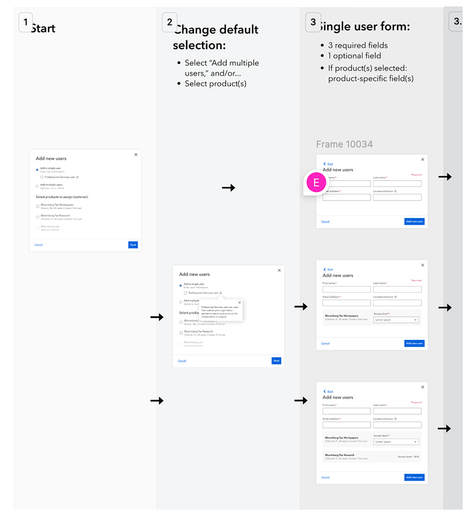
Designing the flow
The “add user" flow had complex branching logic—manual vs. batch upload, optional vs. required fields, different paths depending on admin preferences. Communication with this particular engineering team was also challenging, so I knew a standard user flow diagram wouldn't be enough to convey the interactions clearly.
To solve this, I created a hybrid diagram that combined fully designed UI mockups with user flow logic. Each screen in the modal was mocked up in detail, with arrows showing how users could move through the process based on their choices. The resulting asset was very large, but my PM found it incredibly helpful for aligning the team on the implementation.
Meanwhile, on the Design Systems team (part 2)...
To supplement the diagram, I also created a clickable prototype, using Figma variables for the first time. This let me connect multiple branching pathways to their respective screens and simulate the flow more realistically. The UX team and I geeked out over variable-based prototyping, swapping tips and experimenting together.
Excerpts of the user flow-mockup diagram
Reflection and next steps
The first version of the admin portal is in production. Early feedback from users who migrated from the old tool has been positive—80% prefer the new version, though the sample size is still small.
Creating the architecture diagram early helped me define the direction and ensured every design decision fit within a coherent system. Looking ahead, I'm continuing to expand the admin tool's functionality based on growing technical requirements. I'm also working with the Design Systems team to update my components to align with their new design tokens, ensuring the tool stays consistent with Bloomberg's evolving design language.
Previous project