
Article Alignment Across Bloomberg Law, Tax, and Government Products
Cross-platform consistency, stakeholder navigation, modular design
Inconsistent reading experience
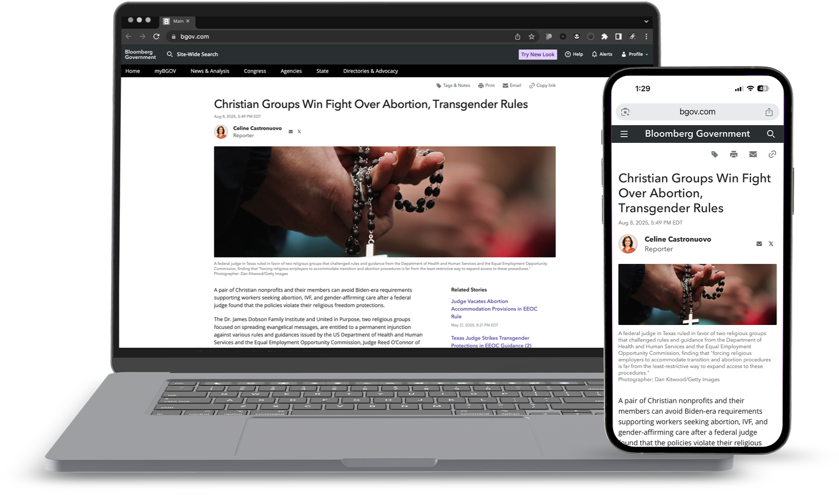
In the Bloomberg product suite, Bloomberg Law and Bloomberg Tax shared a consistent news experience. The problem was that Bloomberg Gov's article pages used a different visual design, creating a disjointed experience for customers using multiple products.
As a lead on this project, I collaborated with two of Gov's designers with the goal of unifying the article experience across all three platforms while maintaining usability for Gov’s specific audience. I drove the design direction while the Gov designers provided domain expertise on their users' needs.
This initiative was part of a broader business effort to streamline the multi-product customer experience and reduce tech debt. The project spanned about a month and required alignment across multiple stakeholder groups.
Standardizing article actions
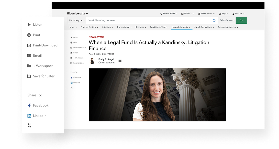
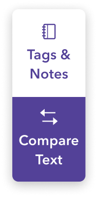
I showed my teammates an existing design element in the Law and Tax products called article actions, which included a print button and social sharing links.
The Gov designers showed me their equivalent feature—a floating action bar—and shared evidence of its success. This design made frequent actions accessible at any scroll depth.
I noticed Gov also had print and email links elsewhere on the page, separate from the floating bar. While these were technically “sharing” actions (versus the bar's “article work” actions), I felt this distinction was weaker than the distinction between article actions and the article content itself. Grouping all article actions together, like Law and Tax did, created clearer information architecture.
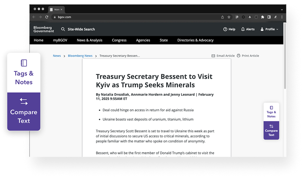
Floating action bar 2.0
To unify the user experience, we integrated a set of key article actions into a refreshed floating action bar on Gov, combining the print and email features from Law and Tax with Gov’s existing Tags & Notes feature. By merging both sets of functionality, we preserved what Gov users relied on while adding cross-platform features. This ensured a consistent and accessible set of features for users, regardless of how far they had read through an article.
+

Initial feedback
Stakeholders felt the initial floating action bar design was too tailored to Gov, addressing needs not relevant to Law or Tax. They noted shorter article lengths on the latter platforms, negating the need for a floating bar, and found its visual design too dominant.
My teammates were concerned that removing the floating bar would disrupt Gov users who relied on it. I found myself caught in the middle. In retrospect, this was a communication problem more than a design problem, and one I kept trying to solve through iteration.
Time to pivot
Based on stakeholder feedback, the next iteration prioritized cross-platform consistency. I started by replicating Law and Tax's layout, including their related stories column. To adapt it for Gov, I used Gov's purple brand color while keeping the same structure.
This surfaced a tension I hadn't fully anticipated: making the experience consistent across all three platforms sometimes created inconsistencies within a single product. Balancing “consistency across products” with “consistency within each product” became a recurring strategic question — one that outlasted this project and came up later in broader conversations with the UX team.
Floating action bar 3.0
For article actions, I proposed a unified solution: a fixed bar above the article body (Floating Action Bar 3.0). This design used a more conventional placement among news sites to improve discoverability, while maintaining the fixed positioning from Gov's original design.
To accommodate each platform’s needs, I designed the component to be modular, allowing engineers to easily toggle specific buttons and ensuring scalability.
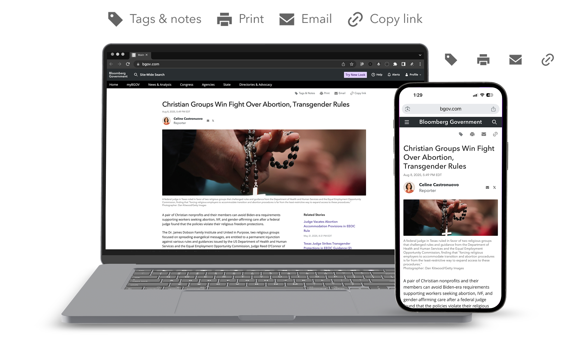
Approved and launched
Stakeholders approved Floating Action Bar 3.0 for use across Law, Tax, and Gov. The design launched on Bloomberg Government, while Law and Tax implementation is scheduled for a future sprint.
After launch, we ran an A/B test comparing the new floating action bar against Gov's previous design. The test found no significant difference in engagement between the two approaches, which put the earlier debate in perspective. The solution worked, but the data couldn't validate one approach over the other.
🙌 A win for the engineers
When I presented the final design to News Engineering (my immediate team), they saw it as a clean improvement that worked well with their existing code. They especially liked the new floating bar, saying, “Why didn’t we think of this before?”
What I’d do differently
This project taught me to recognize when a design problem is actually a communication problem. Once the tension between stakeholders emerged, I kept responding through iteration when what the project needed was a structured conversation, one that asked both sides to articulate not just what they wanted, but why. It's a pattern I'm quicker to spot now.
Previous project
Next project