Bloomberg Newsletter Management
Workshop facilitation, user interviews, research synthesis, responsive design
Information overload
Many Bloomberg newsletter readers shared that they received too many emails. They felt overwhelmed by the volume of content and, at the same time, worried about missing important updates. We referred to the latter as the “FOMO” (fear of missing out) problem.
The challenge: how do we consolidate the email experience so that customers receive just the right amount of content?
I was the sole designer on this project, working with product managers, engineers, and the newsroom.
🔍 About our users
Our users rely on timely, trustworthy content to do their jobs. Many are lawyers with billable hours and limited time, so it’s critical to get them the right information, fast.
Leading a workshop
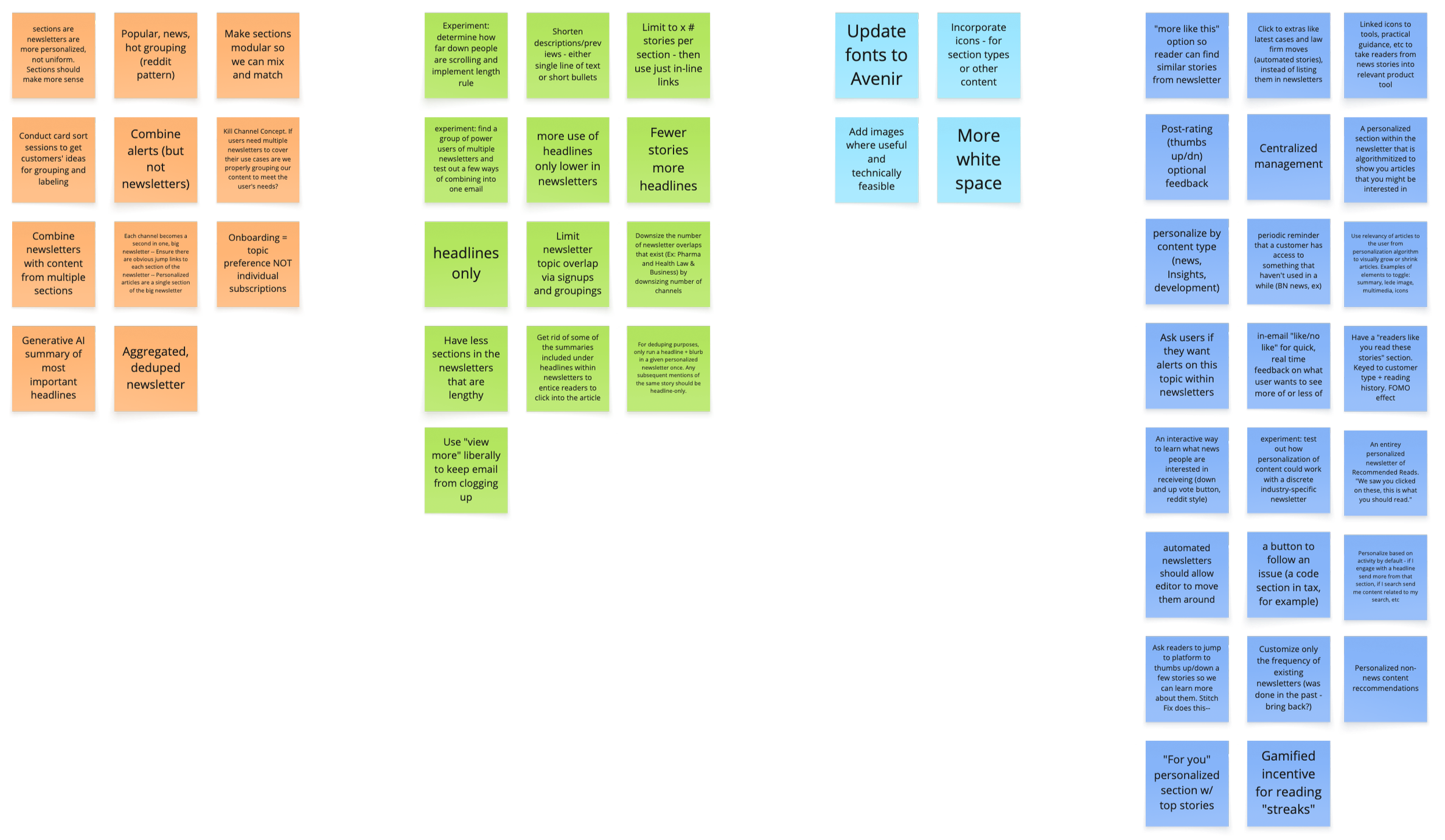
To gather ideas from stakeholders across News, Product, and Engineering, I led a brainstorming workshop. The agenda included:
Refining the problem statement and goal
Individual sticky note exercises
Group discussion and clustering
The workshop was a great way to generate ideas, align teams, and encourage a user-centered approach.
Prioritizing
After reviewing the workshop notes, I met with my product manager and the head of News Product to discuss our next direction. We’d gathered lots of ideas, but we had to start out simple, so we focused on personalization and consolidation.
The ability to combine separate newsletters into a single email was frequently mentioned in the workshop, and also a feature explicitly requested by readers. So we decided on combined newsletters as the first-priority item.
Discovery refresher
A key source of user feedback that had informed stakeholders’ ideas was from sales calls, not user research. Plus, as product roadmaps often go, some time had passed since the workshop in favor of other, more-urgent priorities.
On returning to this project, I decided it was time to refresh our user feedback. I conducted a round of short user interviews.
Some of the questions I asked:
When, where, and how often do you read our newsletters?
What prompts you to open an article from a newsletter?
How do you feel about the length of newsletters?
Two types of users
Interviews revealed two main user perspectives:
“I don’t care how long the email is—just send me one.” (validated our assumption)
1
“I prefer to keep newsletters separate; it helps me stay focused.” (challenged our assumption)
2
A quick review of usage data showed that over 80% of customers subscribed to three or fewer newsletters (of the 40+ available). That might explain why some preferred separate newsletters; there simply weren’t that many to manage.
This data confirmed our assumption that combining newsletters should be an optional feature.
Uncovering a design dependency
While exploring entry points for the “combine newsletters” feature, I realized our existing newsletter management flow was too buried to be discoverable. Users could only toggle subscriptions tied to the specific page they were on, leaving the experience scattered.
Recognizing the need for a centralized newsletter management feature, I collaborated with my PM to pivot the roadmap. We delayed the initial feature to prioritize building the proper place for it to live.
Competitive analysis
Starting on the design for newsletter management, I intuited that the optimal format would be a single page with the newsletters arranged in a table—simple and readable.
I did a quick check of other news outlets to see how they approached the experience. Both NYT and NPR, for instance, included newsletters on a settings page in a simple list with subscription controls. This confirmed my hunch to keep things straightforward.
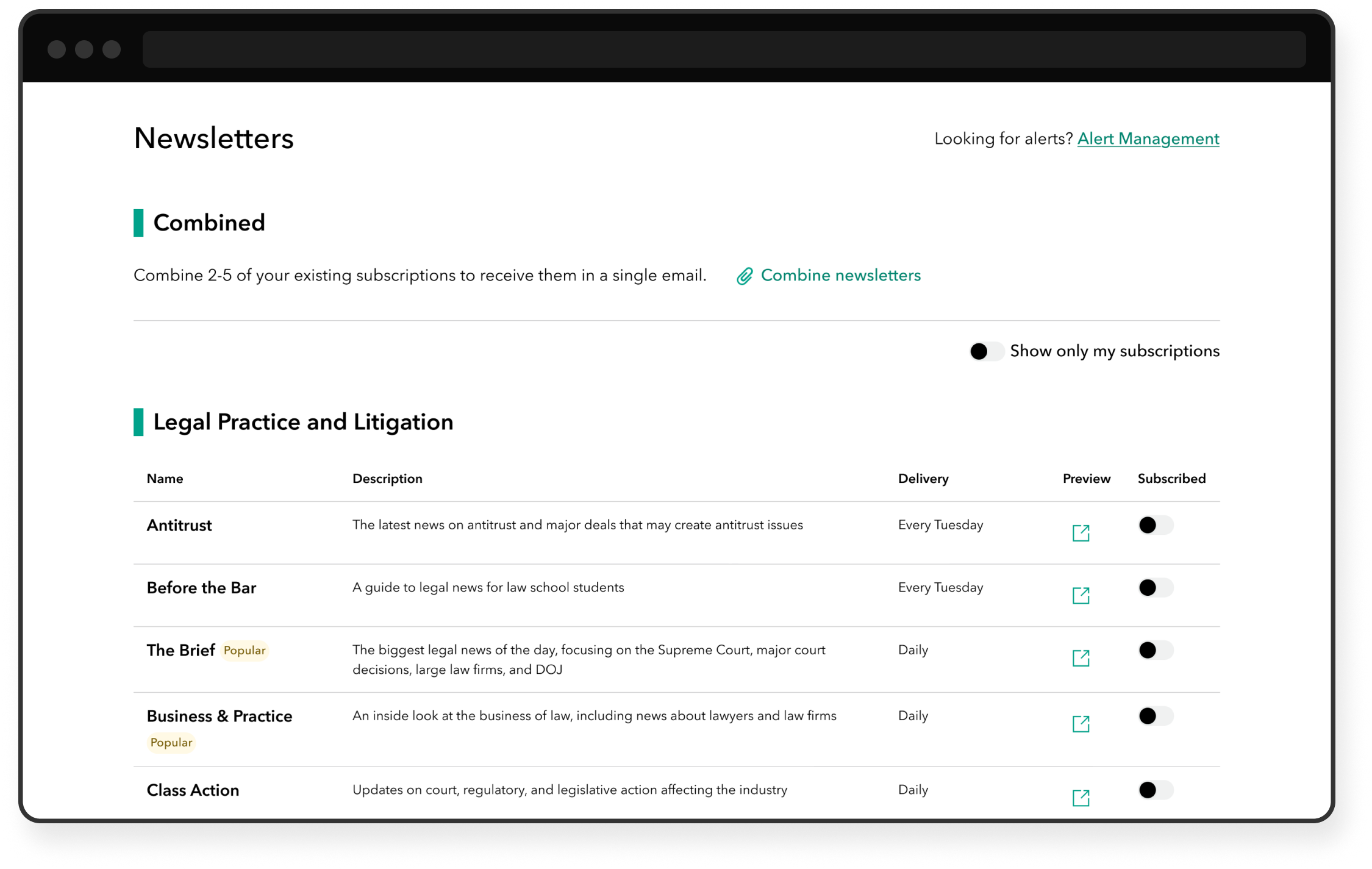
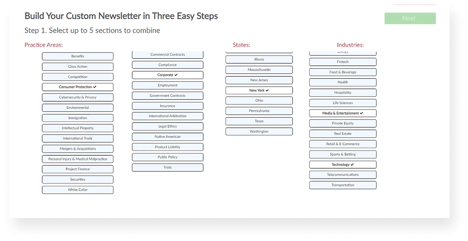
Designing Version 1
Bloomberg’s products are unique in that we have a lot of newsletters (Bloomberg Law has several dozen!). So I focused on a couple main goals for the page:
Make it easy to find a newsletter
Make it easy to decide which newsletters to subscribe to
I arranged the newsletters in alphabetical order and worked with the newsroom to wordsmith short descriptions. To improve clarity, I added columns for frequency (Daily, Tuesdays, etc.) and preview buttons (to view a copy of the title’s most recent newsletter in a new tab).
This design was first published to production on Bloomberg Law.
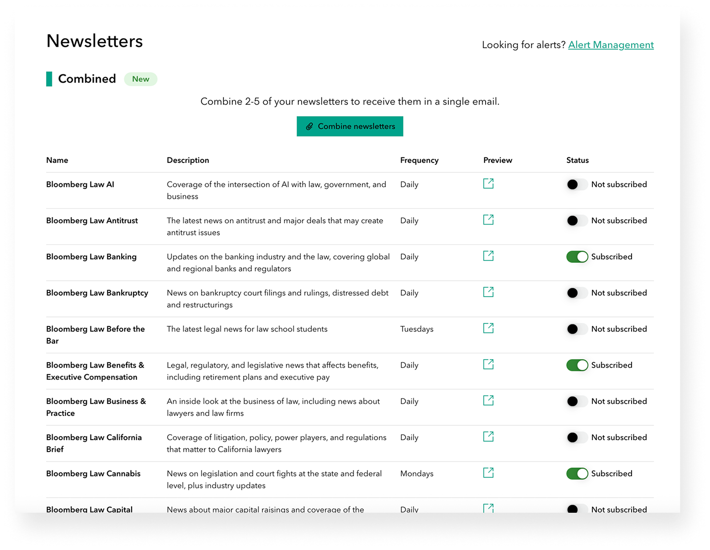
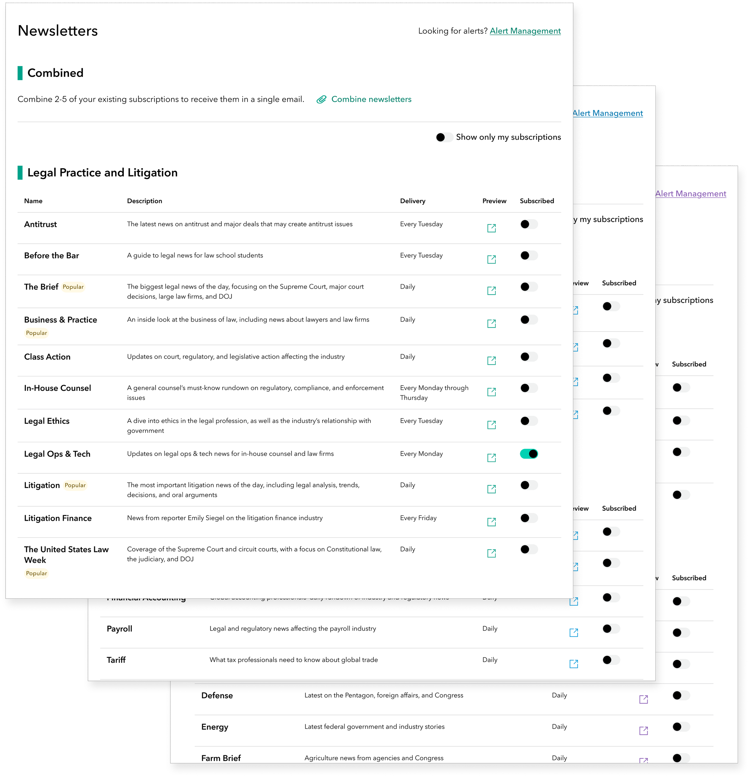
Iterating and standardizing
An important part of my role is standardizing designs across Bloomberg Law, Tax, and Government, so I integrated Version 2 improvements into the initial release for Bloomberg Tax and Government. Here are the updates I included:
Subheadings to organize newsletters into smaller, more digestible sections
Platform-specific brand colors used in accordance with our design system
Badges to highlight popular and new offerings
A toggle for displaying only the user’s existing subscriptions
Finally removing “Bloomberg Law” from the start of every entry! (I was pretty adamant about this from the start; the newsroom finally gave me the go-ahead)
Starting on the “combine” flow
My work on the “combine newsletters” flow happened in tandem with the design of Version 1 of the management page. To start, I examined the existing process of combining newsletters on a competing legal platform. Their flow included:
Choosing which newsletters to include
Reordering the custom bundle
Selecting the type of combined newsletter
I followed a similar user flow when designing our version, tailoring it to our content structure and technical constraints.
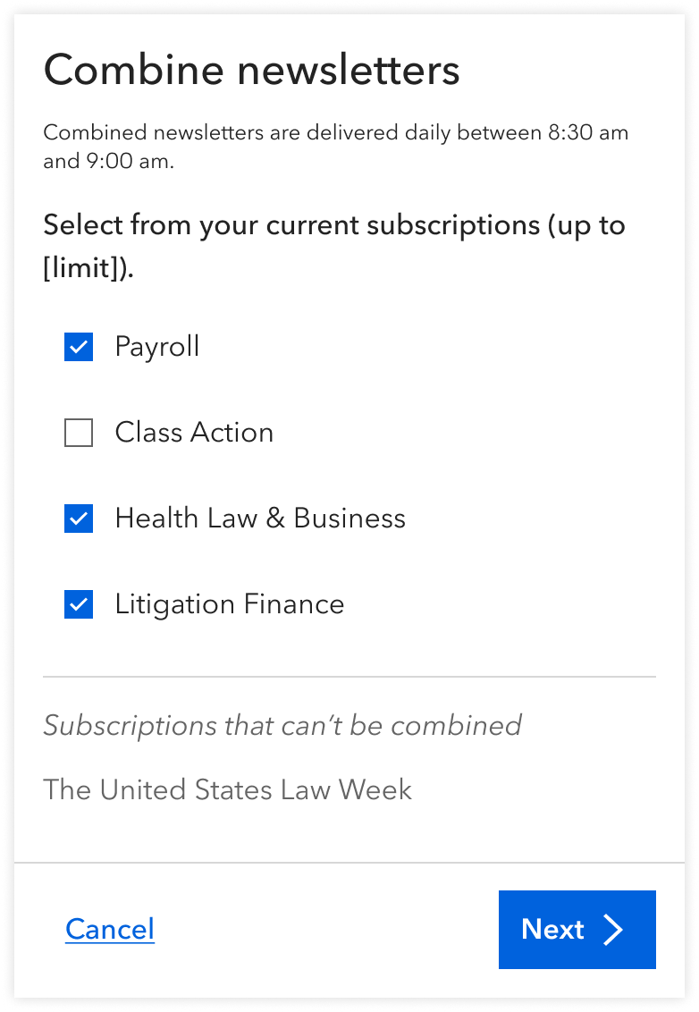
Designing a “wizard”
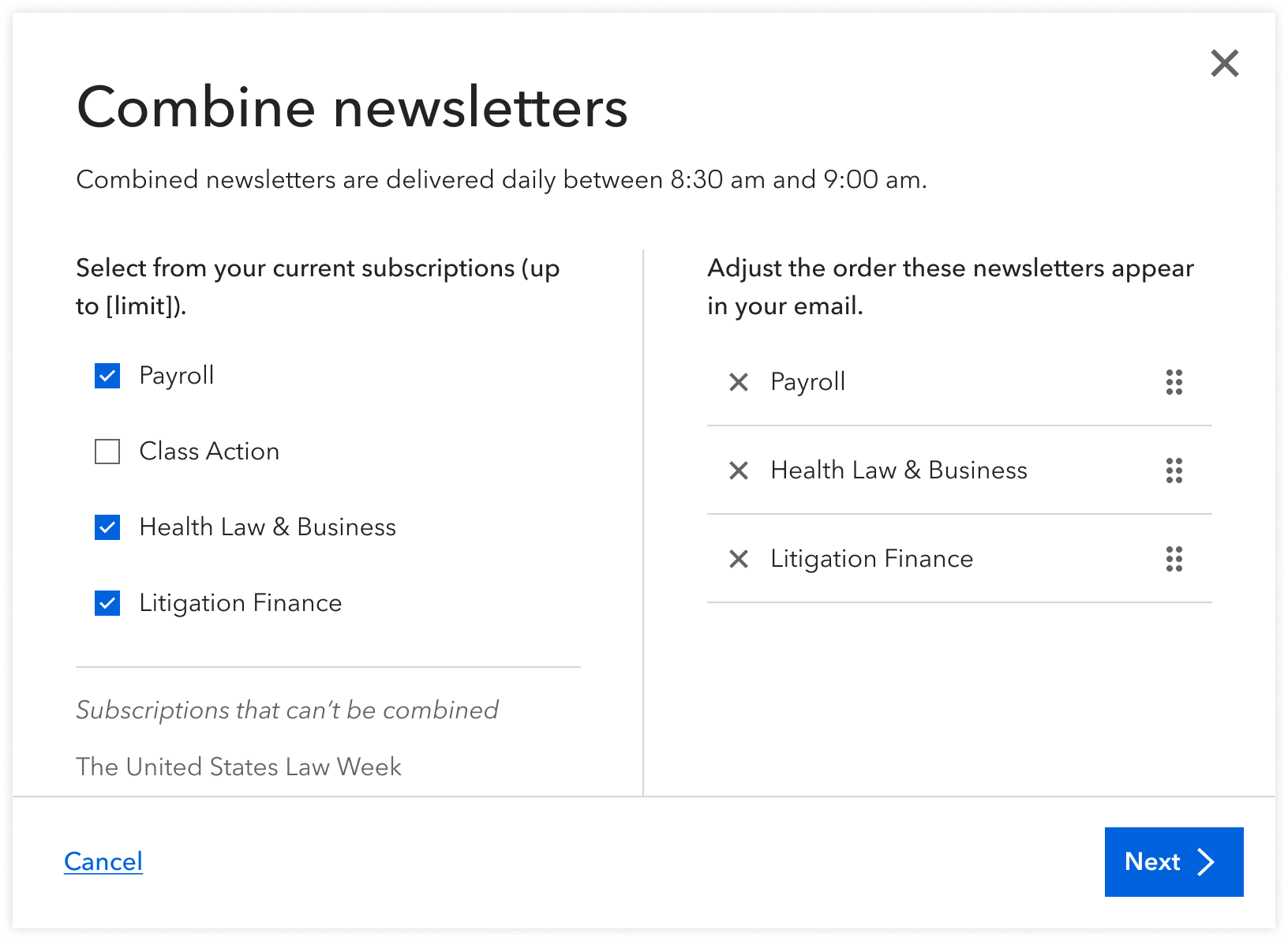
When the user clicked the “combined” CTA, a wizard would open to initiate the following multi-step process:
Select and reorder newsletters
Name the combination
Confirm that the combined newsletter was created
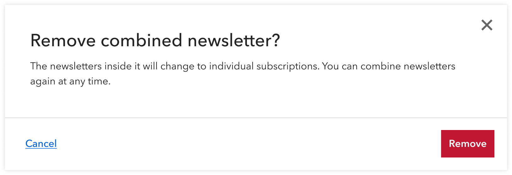
Combined newsletters could later be edited or deleted. On deletion, an “are-you-sure?” modal would launch to prevent any accidental deletion. This was also an important place to include messaging on what followed: individual newsletters remained, only they were separate subscriptions like before.
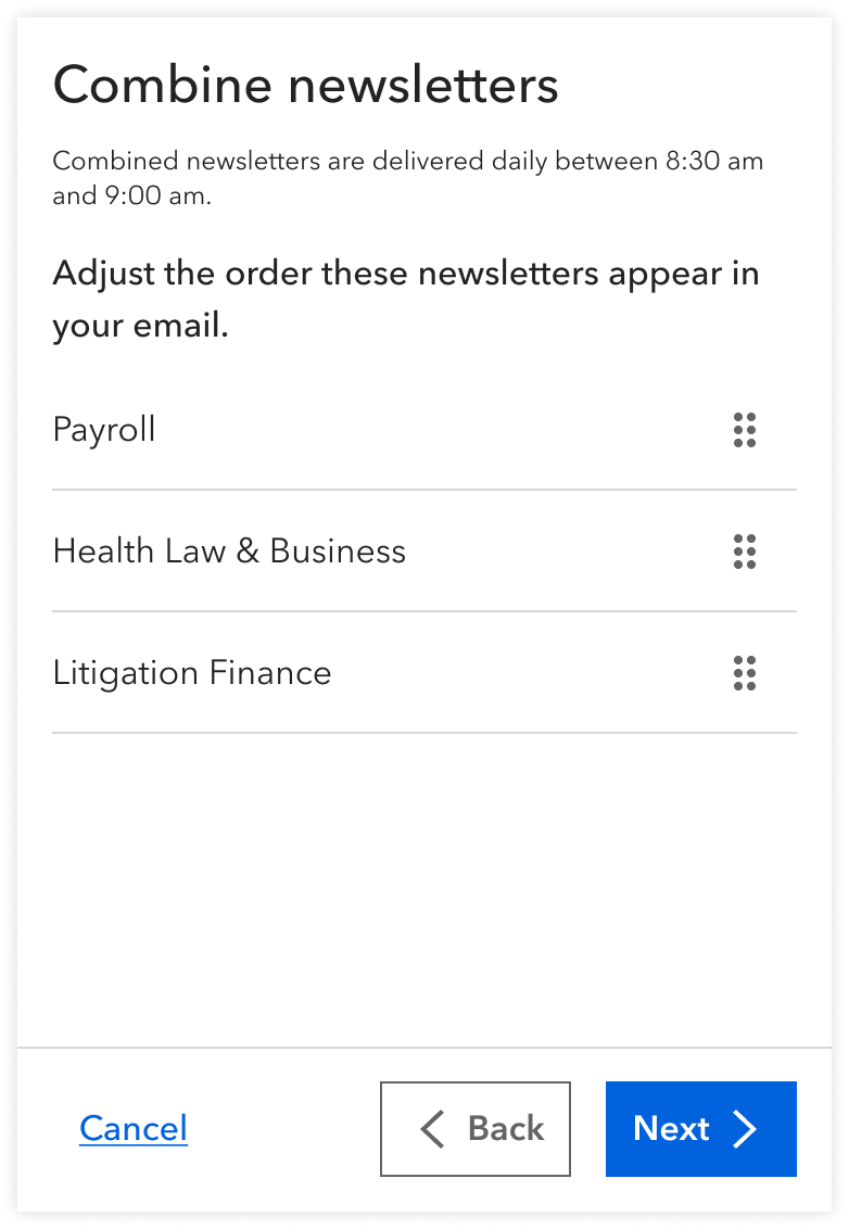
Mobile design
On mobile, the wizard would launch as a bottom sheet that slides upwards from the bottom of the screen. I separated the selection and reordering steps to save space and help users focus on one task at a time.
Pushing back on mobile design priorities
In this project and others, some stakeholders have argued that mobile design wasn't a priority, since about 75% of users access our products on desktop. I continue to push back on that for a couple of reasons:
- The remaining 25% still matter.
- It’s possible users favor desktop simply because mobile hasn’t been made viable yet—a classic chicken-and-egg problem.
A huge win for News Product and our subscribers
Shortly after launch…
The newsletter management page received over 1,200 hits.
Almost 100% of users who started the process of combining newsletters successfully completed that process.
The combined newsletter emails achieved a 55% open rate, up from our usual 30%.
The emails achieved a click-through rate of 7%, up from our usual 2%.
One customer said to a sales rep that the newsletter combo feature was a “game changer.”
Information overload is a theme that touches many of our legacy designs, from in-product experience to email correspondence. Our usage data confirms that consolidation works—users engage more when we reduce noise. This project has given me a critical eye for reducing further noise in subsequent projects.
Next project